Credit Karma · Personal Loans

Turning a fragile lending marketplace into a system for financial decisions.

I restructured how Credit Karma ranked, grouped, and explained personal-loan offers, replacing a flat list and one overloaded tile with an architecture that could carry new products, survive changing inventory, and make materially different financial risks legible to members.

Role
Lead Designer
Scope
Self-directed, end to end: research, strategy, UX, design system, coded prototype, experiment design
Partners
Members, PM, Engineering, Data Science, Analytics, Legal, Partner Solutions, and our lending partners
Timeline
2024 to end of 2025
Before: one flat list of look-alike offers
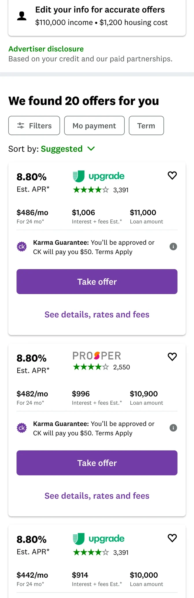
BeforeOne flat list of look-alike offers.
After: a grouped, shoppable feed with a featured shelf
AfterA grouped, shoppable feed.
01The before

One marketplace. Every member treated exactly the same.

Credit card debt or none. An existing loan or not. It made little difference. Everyone landed on the same static list of look-alike offers, ranked the same way, with the same oversized tile on top. Nothing reflected why someone was borrowing, or how a secured loan differed from an unsecured one.

Internally, the big tile had grown into a patchwork of versions, none of it really helping members choose. The marketplace was missing its revenue goals and was fragile enough that small changes tended to break something and cost real money, so the organization had become cautious about touching it, for good reason. I took it on because the core issue looked like one problem, not a hundred: there was no model for how offers got ranked, grouped, explained, or extended, so every new need became another exception.

The visible problem was a hard-to-read list. The real problem was a marketplace with no operating model.

And four definitions of success that had to coexist:

  • Members comparing confidently, understanding fees and collateral, trusting we weren't steering them.
  • The business protecting a major revenue surface while making room for new offer types.
  • The platform supporting ranking and experimentation without spawning more one-off variants.
  • Governance, across Legal and our lenders, needing accurate disclosures on every offer.
02Earning the right

I earned the larger mandate through smaller, measurable wins.

A structural redesign needed more than a persuasive concept. The marketplace had to keep running while we changed it, and leadership needed evidence that the thesis, more contextual and member-centered shopping, could improve the experience without destabilizing revenue. So I started with releases narrow enough to test it safely.

×0
Versions of NextLoan Marketplace shipped for members with an existing loan, each revenue positive.
+0% rev/user
The curated single-offer release built from each member's own data, among members with an active loan. Roughly $1M a month, and the first win here in a long time.
0 green light
Enough proof to earn a full structural redesign, not another reskin of the old marketplace.

Those releases did two things. They generated revenue, and they proved relevance beat a one-size-fits-all marketplace. They also exposed the ceiling: 65% of marketplace visitors are shopping for their first personal loan, and that audience drives roughly 45% of revenue. Curating for one segment couldn't reach them. The marketplace itself had to change.

03The idea

Grouping was the whole idea.

I reframed the marketplace from one flat list into a grouped shopping feed: meaningful shelves a member could orient around, compare within, and decide from, instead of scroll and bounce.

That is where the name comes from. Dynamic because the feed adjusts, every member sees a version curated to their segment. Grouped because the work was the feed structure itself, not a single screen. Built right, other teams could add their own slot on top, and data science could rank the whole set of offers together instead of one at a time.

BEFORE Offer inventory One ranking Flat list One overloaded tile AFTER Offer inventory Ranking and context layer Grouped feed Featured shelf Unsecured offers Secured offers one shared offer architecture

Before, presentation and ranking were welded together and everything landed in one list. After, the feed became the layer that decides where an offer can appear, so a new placement is a rule, not a rebuild.

Before · ControlOne flat list of look-alike offers.
The original flat marketplace, one long list of look-alike offers
After · Variant 3Grouped sections and a redesigned tile.
The redesigned grouped marketplace with secured and unsecured sections
04The member truth

I never went in blind. Members were in the room nearly every time.

Round after round of testing. Card sorts to learn what actually mattered, co-design sessions with members, the layout, the tile, all of it. Monthly payment and APR sit where they do because members told me they mattered most, and the analytics agreed.

What I heard: members mostly wanted to do their due diligence and be sure we were not screwing them. So I pulled their best offers onto a shelf instead of making them dig, and compacted the weaker offers at the bottom, still reachable, just out of the way.

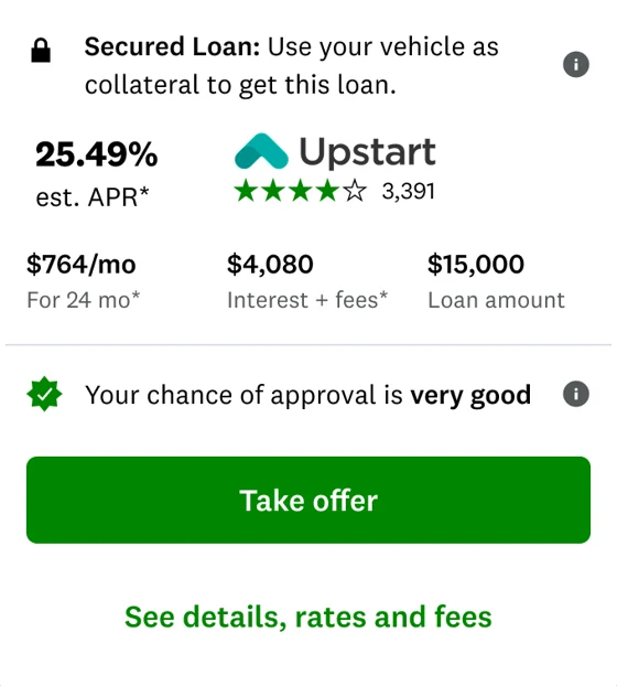
I surfaced the origination fee, and renamed it, because the old term confused almost everyone. It is just a lender fee you pay when you take the loan. On an average loan of around $12,000, that kind of clarity is the product. I made the secured-versus-unsecured distinction explicit for the same reason: a secured personal loan can put a member's vehicle on the line, and that shouldn't be something you discover late.

It wasn't free. Showing the fee, and a “cash to you” number lower than what members asked for, made offers look worse. Click-through on the new tile came in below control, and that was our leading read as to why.

We made the loan look worse because the loan was worse than it appeared. I'd make the same call again. But it was a trust argument, not a conversion argument.

Card sorts, co-design sessions, round after round. Members were in the room for nearly every decision.

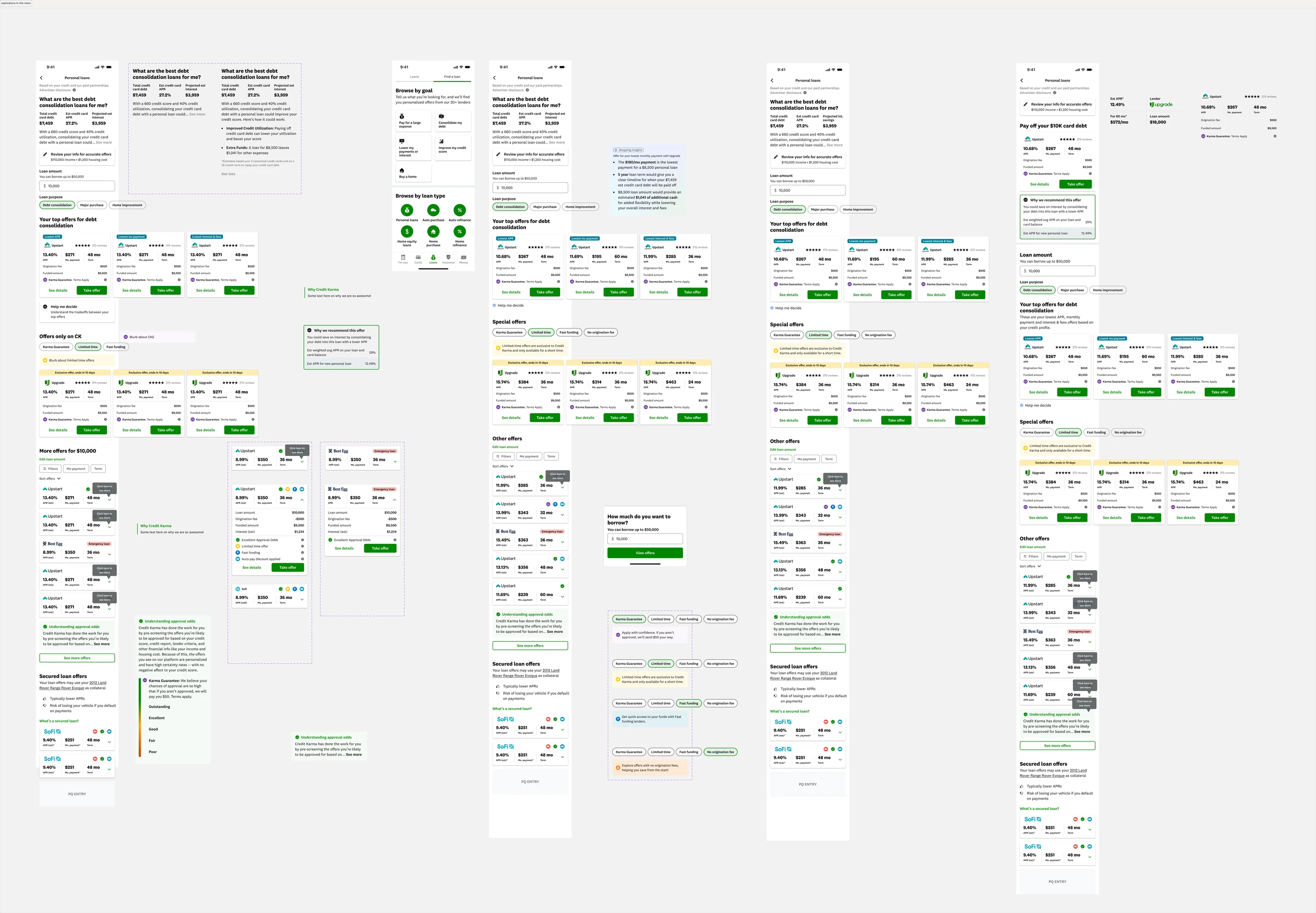
The full Figma exploration canvas, dozens of screens and dead ends
The messy middleThe exploration canvas behind the shipped variants. Months of whiteboarding, and a problem with no real comparison: no other company ranks a whole market of lenders at this scale.
The system behind the feed

The feed systems we explored.

Grouping only works if the structure underneath holds together. A few of the feed structures I sketched before the four shipped variants. Scroll and tap each phone, the notes call out the trade-offs.

Carousel + accordion
Contextualized header
Header
Lender logo
Interest & fees
Value prop?
DetailsCTA
Member data
Member data
Loan slider
Loan slider
Offers summary
APR, lowest monthly payment spectrum
Your top offers
Top offersCKGLTO
Promotional banner / value prop?
Superlative?
9.07%APR$340mo36 moterm
Promotional banner / value prop?
Superlative?
9.07%APR$340mo36 moterm
Promotional banner / value prop?
9.07%APR$340mo36 moterm
Help me decide
Other offers  ·  sort
Promotional banner / value prop?
9.07%APR$340mo36 moterm
Promotional banner / value prop?
9.07%APR$340mo36 moterm
Educational editorial
Promotional banner / value prop?
9.07%APR$340mo36 moterm
See more offers
PQ entry
Carousel + accordion tiles

Both tile types to break the monotony. Top offers, limited-time and CKG ride in a carousel, two at a time. The rest are accordion tiles.

Compact + take-over
Contextualized header
Header
Lender logo
Interest & fees
Value prop?
DetailsCTA
Member data
Member data
Loan slider
Loan slider
Offers summary
APR, lowest monthly payment spectrum
Your top offers
Top offersCKGLTO
Promotional banner / value prop?
9.07%APR$340mo36 moterm
Promotional banner / value prop?
9.07%APR$340mo36 moterm
Promotional banner / value prop?
9.07%APR$340mo36 moterm
Help me decide
Offers for <$$$> for <term>  ⌄
Offers for <$$$> for <term>  ^
Promo
9.07%APR$340mo36 moterm
Promo
9.07%APR$340mo36 moterm
Promo
9.07%APR$340mo36 moterm
Educational editorial
Load more
Offers for <$$$> for <term>  ⌄
PQ entry
Compact tile + bottom take-over

Only the compact tile, with a bottom take-over. The feed is an accordion split by term and loan amount, up to five offers per group.

Grouped accordion
Contextualized header
Header
Lender logo
Interest & fees
Value prop?
DetailsCTA
Member data
Member data
Loan slider
Loan slider
Offers summary
APR, lowest monthly payment spectrum
Your top offers
Promotional banner / value prop?
9.07%APR$340mo36 moterm
Promotional banner / value prop?
9.07%APR$340mo36 moterm
Help me decide
Limited time offers
Promotional banner / value prop?
9.07%APR$340mo36 moterm
Other offers
Promotional banner / value prop?
9.07%APR$340mo36 moterm
Educational editorial
Promotional banner / value prop?
9.07%APR$340mo36 moterm
See more offers
PQ entry
Grouped feed, accordion tiles

Accordion tiles grouped into top offers, limited-time, CKG, and other. Educational content between the groups.

Secured / unsecured split
Member data
Member data
Loan slider
Loan slider
Offers summary
APR, lowest monthly payment spectrum
Featured offers
Top offersCKGLTO
Promotional banner / value prop?
9.07%APR$340mo36 moterm
Promotional banner / value prop?
9.07%APR$340mo36 moterm
Promotional banner / value prop?
9.07%APR$340mo36 moterm
Unsecured offers
Promotional banner / value prop?
9.07%APR$340mo36 moterm
Promotional banner / value prop?
9.07%APR$340mo36 moterm
Secured offers
Uses your vehicle as collateral. Here is what that means.
Promotional banner / value prop?
9.07%APR$340mo36 moterm
PQ entry
Grouped by secured vs unsecured

Secured and unsecured split into their own sections, each with filters, plus a plain explainer of collateral. Closest to what shipped.

05The featured shelf

Four things members cared about, so four things I surfaced.

User testing pointed to the same set every time. So the featured carousel pulls a member's genuinely best offers, and an explainer sits under each one, because plenty of people did not know what these terms meant.

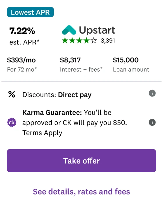
Karma Guarantee Backed by $50 if a member is not approved. In practice, close to a sure thing.
No lender fees Some members will trade a slightly different rate to avoid that lender fee entirely.
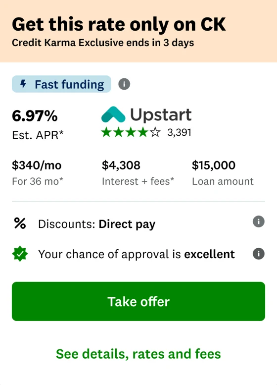
Fast funding For members who need the money to land fast, surfaced instead of buried.
Limited-time Time-boxed offers running with lenders, shown while they last.
9:41 Offers with Karma Guarantee Select loan feature Limited Karma Guarantee No fees $50 back if you're not approved. Apply with confidence. See terms. Upgrade ★★★★☆ 375 8.80% APR (est)* $442 Mo. pay* 24 mo Term $50 Karma Guarantee See details Take offer SoFi 8.9% how it could feel in-apptap a feature
What didn't work

The right insight, delivered the wrong way.

The variant carrying the featured shelf was consistently a weaker version of the variant without it, with the highest abandonment rate of anything we tested. Our best read: it added another section above the feed, so there was more to load and more to scroll past before reaching offers. On a page where load time drives abandonment, that outweighed the benefit of the curation.

The member insight held up. The delivery mechanism didn't. I'd test these as filters on the existing feed instead, so surfacing value doesn't tax the thing that was hurting us.

06The offer tile

The offer tile had to be rebuilt too.

The tile had been attempted before and had proven hard to move, and it is easy to see why. It is not just design. It is engineering, member research, business development, and legal all at once, and every lender had to approve how their brand appeared on the new tile. Moving it meant driving that alignment myself, holding one design direction steady while a dozen stakeholders pulled on it, and getting each partner to yes without watering down the work.

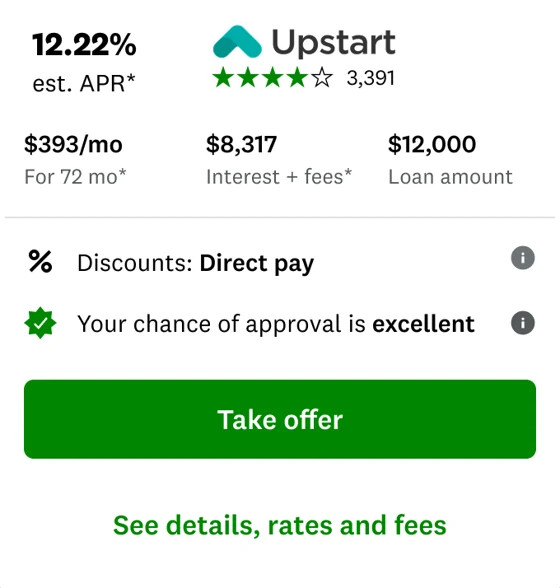
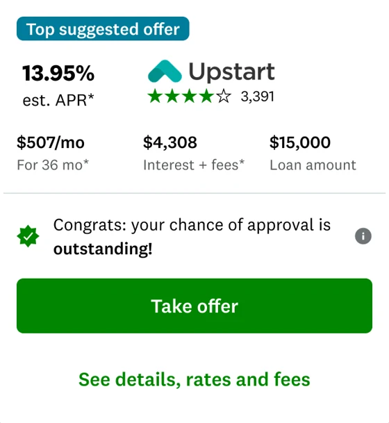
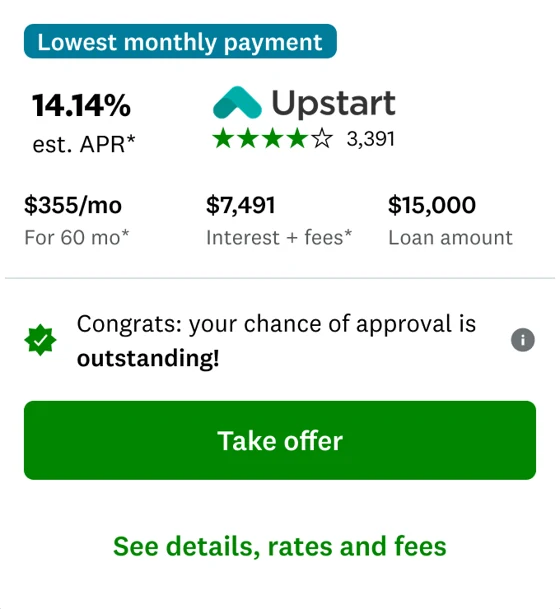
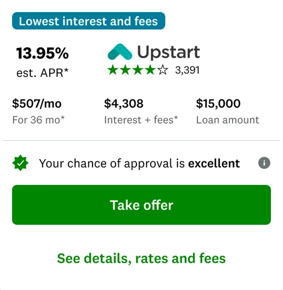
I audited every tile variant in production first, the same component stretched across badges, superlatives, and banners with no consistent hierarchy, then rebuilt it as one flexible architecture that could serve top offers, promos, and curated placements without forking again. APR, monthly payment, term, fees, cash received, and approval context became the comparison core; promotional and partner content had to arrange itself around that core without displacing it.

The hardest disagreement was about showing less. We wanted fees and “cash to you” on every offer, but several lenders were sending the disbursed amount in the loan-amount field, so the same number meant different things by partner. I pushed to ship a deliberately thinner tile for those offers rather than a number we couldn't trust. An inconsistent feed is a usability cost. A confidently wrong number is a trust failure. The system's rules should say which one we accept.
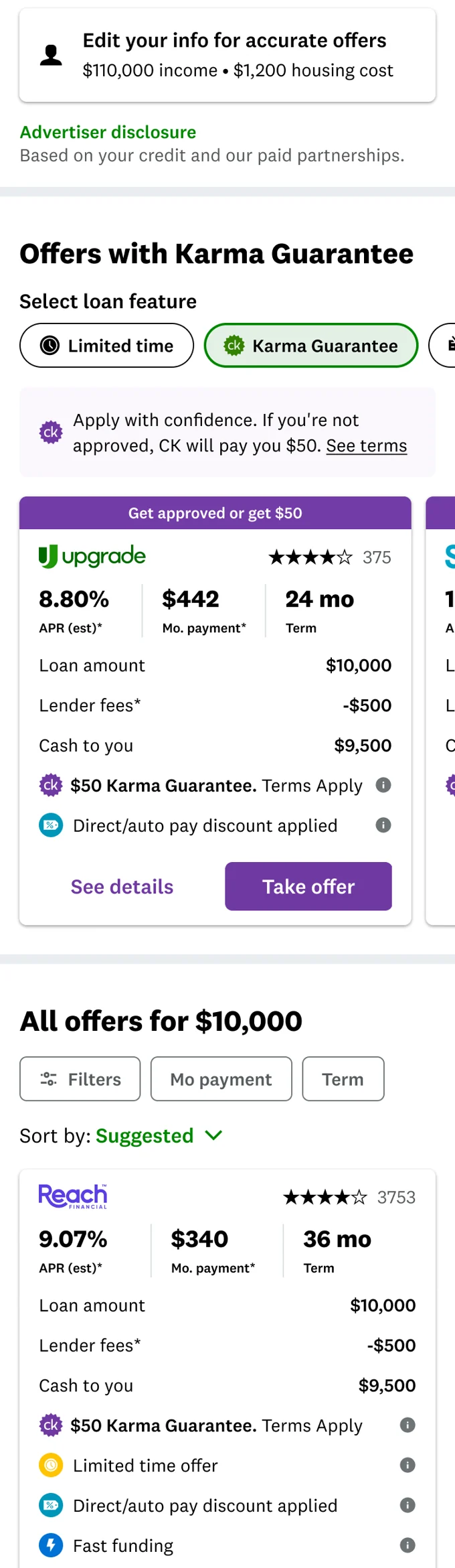
The tile, before and after.

The old offer tile, cluttered with badges
BeforeBadges and superlatives stacked on, with no consistent hierarchy for the numbers members compare.
Reach ★★★★☆ 3,753 9.07% APR (est)* $340 Mo. payment* 36 mo Term $50 Karma Guarantee, terms apply Fast funding See details Take offer
AfterOne flexible tile, sketched from what shipped: APR, monthly payment, and term up top, fees made transparent, and a clean Take offer.
The audit

Every version of the tile, in one place.

Offer tile variant
Offer tile variant
Offer tile variant
Offer tile variant
Offer tile variant
Offer tile variant
Offer tile variant

One component, stretched across every promo and ranking need, with no consistent hierarchy. That was the case for rebuilding it as a single flexible tile.

The experiment

Four variants, one change at a time.

Every screen opens the same on purpose. The differences live further down, so scroll each phone to watch the feed change from a flat list into grouped sections and a featured shelf.

ControlThe existing marketplace.
The control personal-loans marketplace, one flat list of offers
Variant 2Only the offer tile changes.
Variant 2, the same marketplace with only the redesigned offer tile
Variant 3Offers split into sections.
Variant 3, offers split into unsecured and secured sections
Variant 4The featured shelf of best offers.
Variant 4, a featured carousel of a member's best offers
07The hard part
Reading a broken experiment

The first reads were bad. The easy move was to call it a failure.

Revenue was down four to five percent and clicks were soft. At the exposure we were running, that dip was worth over a million dollars a month, so the pressure to roll it back was the responsible instinct, not a timid one.

But the losses didn't behave like a design problem. They were uniform across variants that changed very different things, and they tracked load time, not layout. So I argued against the conclusion rather than for my design: we defined a new abandonment metric to catch members dropping during load, ramped down to cap the risk while engineering worked, and added a fifth variant with identical UI on the old serving API to separate ranking from design.

Once that noise was out of the read, Variant 3 came through above baseline and held. The win wasn't that I defended the work. It was that the team didn't make a seven-figure call on contaminated evidence.

baseline (0%) launch down 4 to 5% at launch winner, +3.1% rev per user about $2.1M a month
The winning variant, the grouped feed with secured offers split out

The decision that protected members is the one that made the money.

When we looked into why Variant 3 won, most of the lift traced to one thing: splitting the feed pushed secured offers out of the default path. Secured loans put a member's car on the line, and we'd made that call for member-risk reasons: those products shouldn't get the same real estate just because they convert. It turned out to be the revenue decision too. Members who weren't being funneled toward collateralized debt converted better on the loans that actually fit them. The redesigned tile carried the rest, tighter and clearer, so more members read the offers.

+1.5 to 0%
conversion per user, revenue positive
+0%
offer impressions per user from the new tile. Worth a caveat: the tile was ~20% shorter, so some of this is more offers fitting on screen rather than deeper evaluation. We couldn't cleanly isolate the two.

The complication worth naming: the winning variant showed declining clicks and applications alongside strong conversion and revenue. Fewer clicks, better ones. Since clicks per user was our declared success metric, we had a variant that lost on the success metric and won on the guardrail, which forced a real conversation about whether we were measuring shopping activity or shopping outcomes.

08What shipped

The end of the story is the marketplace members use now.

This is the shipped design, rebuilt here as a faithful, interactive recreation, coded by me in Claude rather than Figma, the way I prototype every flow so engineering can see exactly how it should move and reprice. It went live to all members; the production surface keeps evolving as new tests run on top of it, so what's in market today reads close to this rather than frozen to it. Drag the loan amount to reprice offers, switch the featured shelf, filter, and open an offer. The notes on the side call out the decisions as you scroll.

Live and playable, right here. Drag the loan amount, switch the featured shelf, and open an offer.

The payoff
+0% rev/user
From the smarter ranking the grouped feed unlocked, against a 0.5% forecast. The design change (grouping the market) is what let data science rank every offer at once instead of one tile at a time.
~$0M/mo
Incremental revenue at scale from the redesign.
+0% rev/user
From the earlier release that proved the thesis, about $1M a month on its own.

Since DGM shipped to all members, personal loans became one of Credit Karma's top growth drivers, per Intuit's public earnings. It was never a one-time redesign. It became the foundation everything else builds on.

The bigger win

The number proved it. The framework spread it.

The revenue lift got the attention, but the durable win was the pattern underneath it: contextualization, building the experience around each member's own data and intent instead of a flat list everyone sees. Personal loans was where it was risky enough, and measurable enough, to prove.

Once it held up on the revenue engine, it stopped being a personal-loans decision and became a model other teams adopted. The same contextualization framework carried into credit cards, HELOC, and insurance, and became part of a cross-team initiative called Snipes. That is the leverage I optimize for: prove a pattern on the hardest surface, then hand it to the rest of the org so the work outlives the project and the team keeps compounding it after I have moved on.

Still shipping

Designed to keep evolving.

The clearest sign the work was structural is what happened next. Data Science applied their re-ranking models directly on top of the winning grouped feed rather than restarting from the old marketplace, and the team kept shipping from it. The compact tile below is the next step, one curated top offer with scannable tiles beneath. I'd moved to the tax vertical by then. Good structure keeps paying off after you've moved on.

Click to open the offer tile
09Looking into the future

Where this goes in two or three years.

This one never shipped. It is my own concept for where the marketplace goes next, built in a newer design system and coded the same way I prototype everything else. Everything above it is real work with real experiment data behind it. This is the argument for what comes after.

The shipped marketplace still asks members to shop. The next version should be willing to recommend, and then show its work. One offer chosen for the goal you actually have, with the reasoning visible: your blended APR on existing debt against the new rate, and the interest saved calculated in the open. A recommendation a member can audit is a recommendation they can trust.

Your context moves into sticky pills at the top, loan amount, purpose, income, housing, so changing your mind is one tap from anywhere on the page instead of a trip back to a form. And the rest of the market stays directly underneath in compact tiles that expand in place, because committing to a recommendation should never mean losing access to the alternatives. That was the lesson from the featured shelf: surface value without taxing the path to everything else.

Live and playable, and it goes deeper than the screen you land on. Change the loan amount or purpose and everything reprices. Sort and filter the market, or over-filter it to see the empty state. Open any offer for the full cost breakdown and an amortisation view, then take it through to the lender handoff. Sample data throughout.

What I took from it

The most useful thing wasn't a screen.

Looking back, the decisions that mattered most were structural. A few things I would carry into the next problem like this:

  • Treating a fragile page as a system, not a screen. The architecture for how offers get grouped, ranked, and shown outlived any single experiment.
  • Designing the change so it could be measured. Staging the variants cost some speed up front and bought certainty and durability in return.
  • Holding steady when the early data looked ugly, and separating design impact from infrastructure noise before making a call.
  • Leaving room for other teams to build on top. Because the feed was grouped, data science could rank the whole market of offers at once instead of one tile at a time, which kept compounding the result after I moved on.

What I'd do differently: instrument performance before ramping, not after. We couldn't tell a design problem from a load-time problem because we hadn't built the metric that distinguished them. That would have saved us a quarter.

Next project

Proving members wanted control before we bet a roadmap on it

View