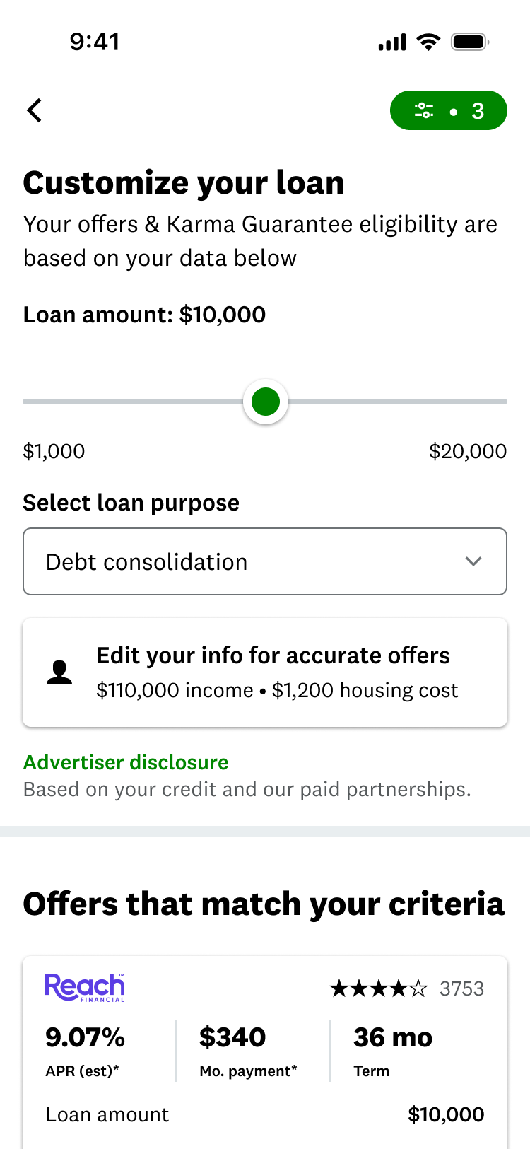
The shipped marketplace with three criteria applied. The count sits on the control itself, so members can read their active state without opening anything.
Nobody handed me this project. I was running sessions to figure out what we should build next, watched members get stuck shopping for a loan, and took it to product as our top priority. Then I ran the work that told us whether shopping tools were worth building at all, on the screen personal loans makes its money on.
The shipped marketplace with three criteria applied. The count sits on the control itself, so members can read their active state without opening anything.
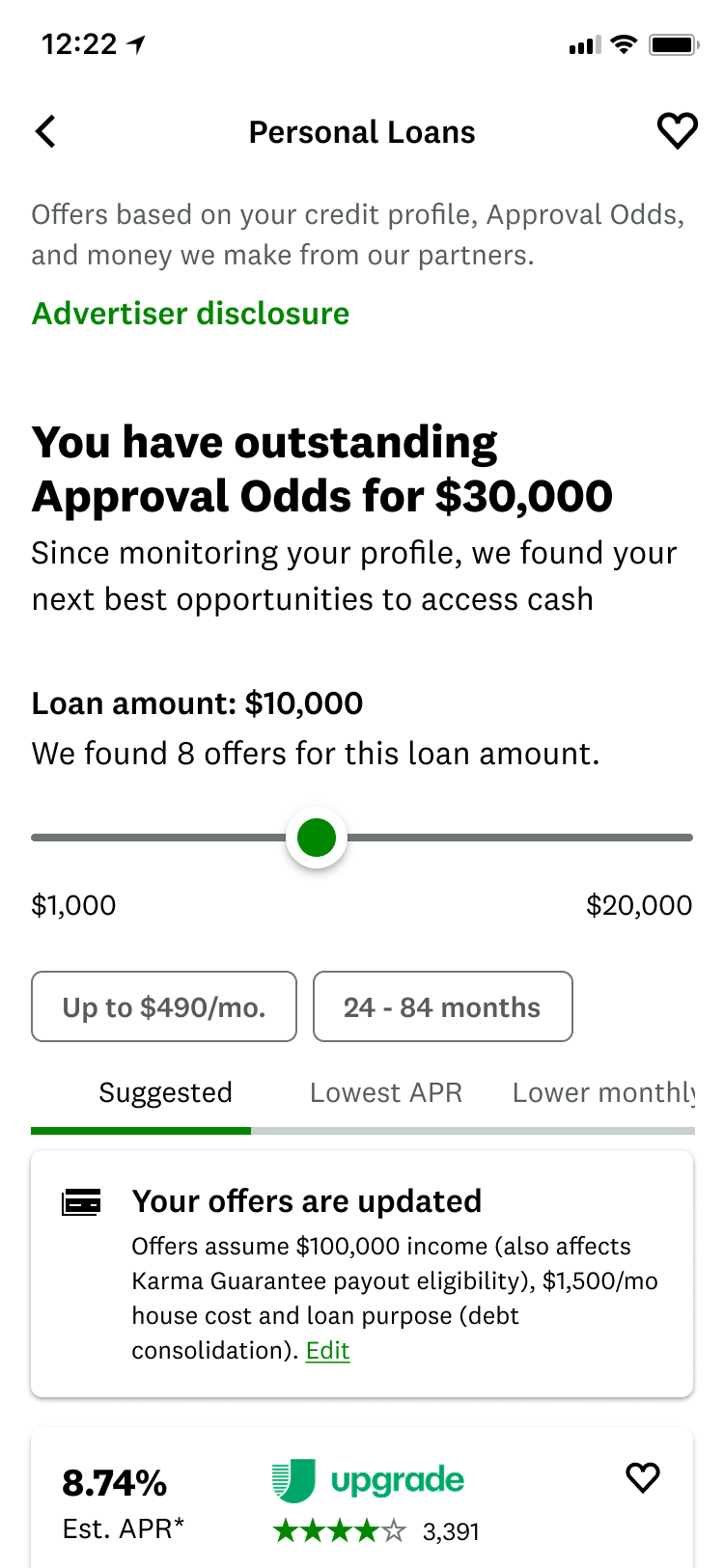
Before. The marketplace members actually met.
We had just shipped the grouped marketplace at a low ramp, and we were deciding what to do next. Instead of debating it in a doc, I ran sessions where members opened the app and shopped like they normally would, so we could watch the thing work before we picked.
It fell apart in front of me. Members with a lot of offers just stalled. They couldn't tell which one was actually better. Several said they wished they could filter, while the filters sat right there on the screen. Almost nobody understood sort.
We had left filtering out of that redesign on purpose. Doing it properly was too big to carry at the same time. Now that decision was the thing standing between members and the choice they came to make.
I didn't even see that filter option until you pointed it out.
Member, follow-me-home session
This was the expensive answer. Real shopping controls meant pulling in product, design, engineering, and data, plus changes to the marketplace underneath, all on the screen that pays for the business. Pick the wrong model and we pay twice: once to build it, again to undo it.
I pushed for it anyway. It was the biggest problem any of us had watched happen with our own eyes. It also became one of the first times the team picked its next project from something we saw members struggle with, instead of from the roadmap we already had.
Making that case meant answering the harder question underneath it:
What model of member control can this marketplace scale, and what evidence should it need before funding one?
That set the bar. People saying they liked it wouldn't be enough. The release had to change what members actually did, measured in offer clicks per user, with revenue per user as the guardrail that would stop us if the marketplace took a hit.
Each concept was a different answer to the same question, and each one changed how close the controls sat to the offers. I walked borrowers who were shopping for a loan right then through all five, one at a time, and ended by asking them to compare.
I wasn't asking which screen looked nicer. I wanted to know what they noticed on their own, what they expected each control to do, when they'd filter versus sort, and where more options stopped helping and started getting in the way.
Tested: whether putting the key controls right on the page was worth the space they took above the offers.
Learned: people went straight for controls at the top, and wanted amount, term, and APR right away.
Implication: being close to the offers got people using it, but paying for that space forever left no room to grow.
Tested: whether walking people through steps would build more confidence than handing them controls.
Learned: people liked being asked what mattered first, but the steps felt like work standing between them and the offers.
Implication: keep the idea, lose the ceremony. Ask inside the filter, not as a gate in front of it.
Tested: whether controls could stay within reach the whole time without crowding the offers.
Learned: staying put changed behavior. People said a pinned bar got them in earlier and let them adjust without losing their place.
Implication: the best balance of being seen, staying reachable, and leaving the offers room.
Tested: whether an assistant could do the narrowing for you by suggesting what to focus on.
Learned: nobody wanted the chatbot. But one member mistook a plain input for a search box you could talk to, and got excited. People wanted a smarter input, not a conversation.
Implication: shelve the assistant, keep the insight. It came back later in the marketplace AI work.
Tested: whether cards inside the feed could make filtering feel like part of browsing.
Learned: cards buried in the feed got missed, and people didn't like controls showing up where they expected offers.
Implication: filtering needs one predictable home, not pieces scattered through the feed.
The concept the team was most excited about was the one members shut down fastest. Nobody wanted to have a conversation with a marketplace. But one member mistook a plain input box for a search bar you could type a sentence into, and lit up. So the appetite was for a smarter input, not a chat. We shelved the assistant and kept that insight, and it came back later in the marketplace AI work.
That round also narrowed the field. I took what members actually responded to, control that stayed close to the offers, and built it into three entry points. Which left the question the first round couldn't answer: would anyone notice the entry point if we didn't point at it? So the second round gave people a task first, then went back to whatever they had walked straight past.
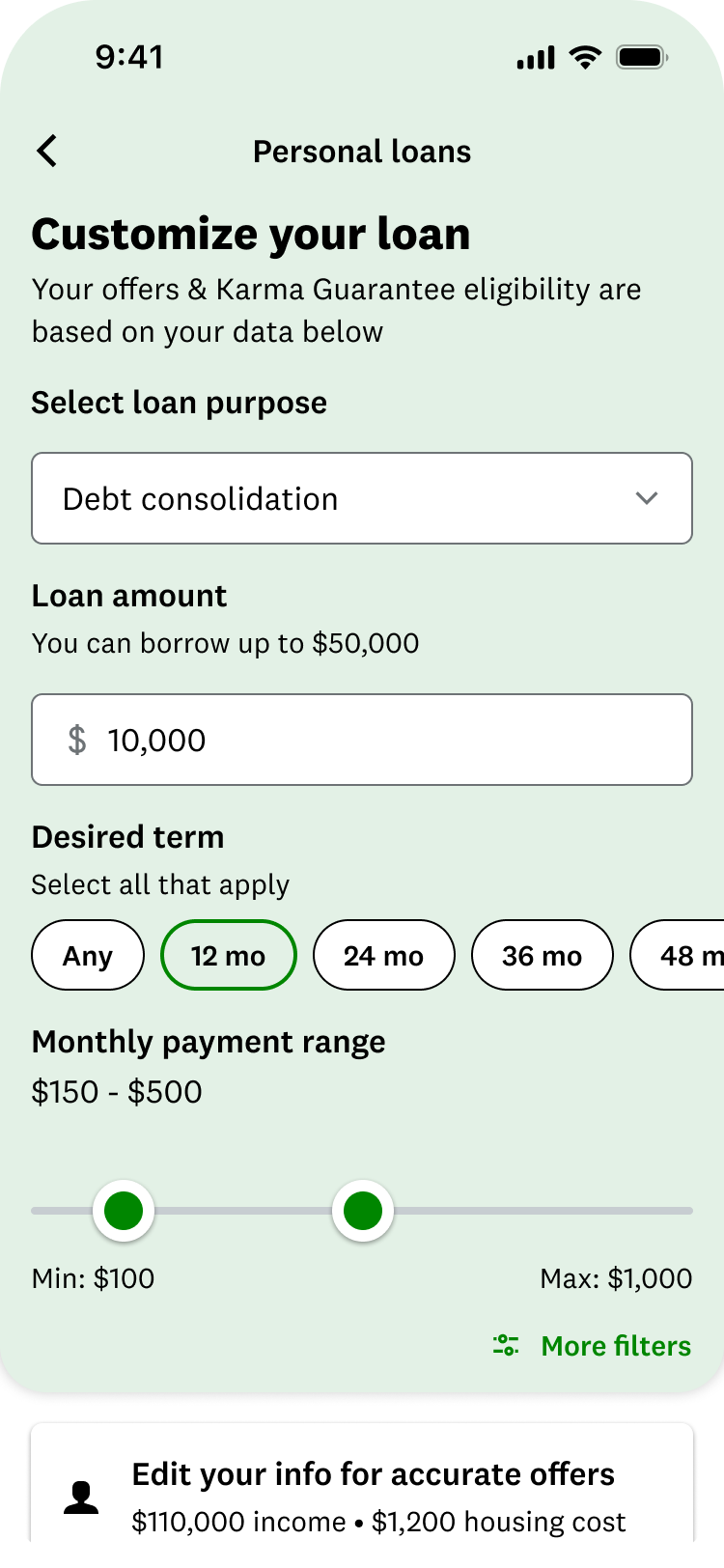
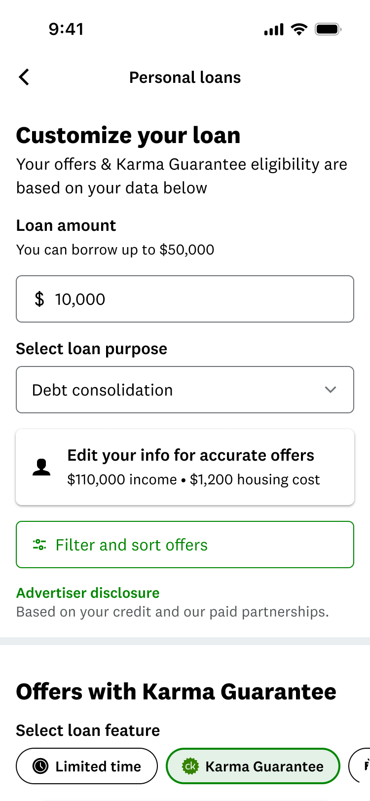
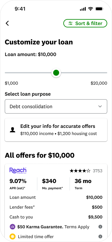
It gives you the most use since it moves with you when you're scrolling.
The inline version came last. It looked great on load, but you couldn't adjust anything without scrolling back to the top, which one member called a pain. The button made sense to people but felt dead, and it spent a whole row of the marketplace to say one thing.
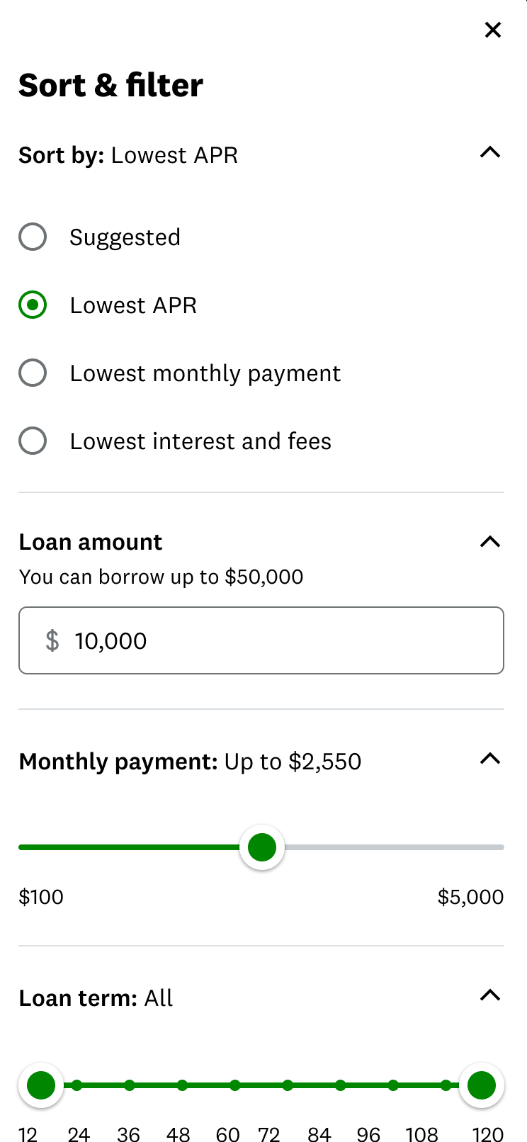
The same round tested two layouts for the menu the control opens. People split evenly on accordions versus seeing everything at once, so it had to work both ways. Toggles were easier to read than checkboxes on a phone. And a full-screen takeover felt heavy, because people wanted to keep an eye on the offers they were narrowing.
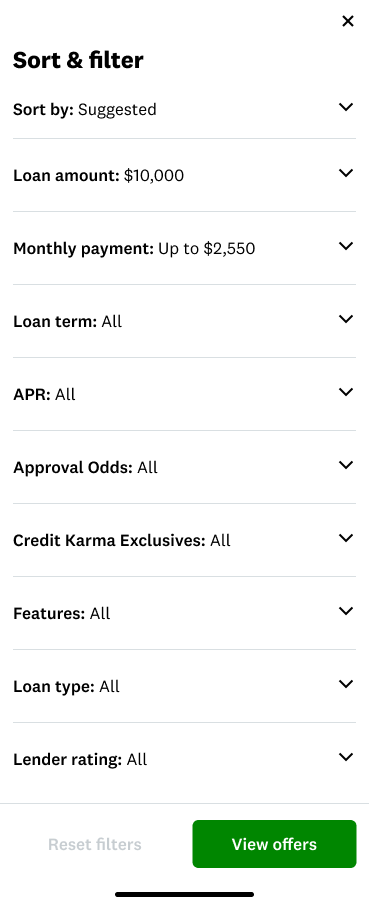
A card sort then ranked the controls themselves: loan amount and monthly payment came first almost every time, APR mattered but usually came second, and loan purpose landed far lower than the product expected.
"Members liked it" doesn't carry a room that wasn't in the sessions. So I ran every direction through the same six questions. Three are about the person using it. Three are about the marketplace that has to live with it.
Can people find it without being told it's there?
Do they know what will happen before they tap?
Can they adjust without losing their place in the offers?
Do the controls leave room for the offers people came for?
Can it take on new criteria and new tools later?
Can we tell real demand from the noise of a big release?
It was the only option that cleared all six. People found it on their own without it taking over the page. It stayed with them while they scrolled, so they could adjust without losing their place. And it could take on new criteria later without redesigning the marketplace again.
The obvious move was to launch everything and measure after. I pushed the other way: ship the pinned entry point with a small set of the controls that mattered most, and build it as the first layer of the system instead of the whole thing.
That's sequencing, not lowered ambition. Fewer things moving at once meant we could actually read the result, the revenue stayed protected, and we got a clean answer to the only question that justified spending more: will members use deeper controls at all? Underneath, the model was already built to carry more, including criteria we hadn't designed yet.
Members got one reliable way to reach filtering and sorting anywhere in the feed. Inside, they could narrow on the things that actually change what a loan costs: loan amount, term, APR range, monthly payment, approval odds, lender rating, and features like fast funding. A live count on the apply button showed how many offers were left, so you could see what each choice did before you committed to it.
Live and playable. Open Sort & filter, set a monthly payment you can live with, pick a term, ask for fast funding, and watch the count on the button change before you apply. Over-filter it and you get the empty state we designed for. Built on the same KDS tokens and compact offer tiles as the marketplace itself, and coded rather than drawn, which is how I hand work to engineering.
The denominator matters here. This isn't 20% of everyone who visited. It's 20% of the people who had already shown intent by opening the filter, and most of it came from approval odds, something we had never let members filter on before.
That moved us from "we think members want shopping tools" to "the people shopping are using them."
The overall numbers barely moved, and flat on a revenue screen reads as a wasted quarter. I didn't argue with the number. I argued with how it was being read, because the average was hiding two opposite stories.
Members with a handful of offers got almost nothing out of it, because there was barely anything to narrow. Members staring at a huge list, the exact people we built this for, moved in the right direction. Put the two together and they cancel out, so the readout showed neither.
That changed what the team walked away with. Shopping controls are worth more the bigger the list a member is handed, which is exactly the argument for building them into a marketplace that keeps getting more personalized and more crowded. It also changed how we cut the next read.
The filter was the visible part. What lasted was the model, a way to measure this kind of behavior, and a way to add capability to a screen nobody wanted to break.
Measured demand for deeper control, from the members the marketplace most needed to serve.
The grouped marketplace, the AI work, and preference capture all built on this model instead of their own.
Adoption, offer clicks, a revenue guardrail, and the segment cut that saved a flat average from itself.
Phasing a release on a revenue screen gave the team a repeatable way to test expensive ideas cheaply.
Tie the adoption number to what happens after it. Which offers did members pick once they filtered? Did those offers match what they said mattered? Did filtering change who applied and who converted? A leading indicator earns you the right to invest. Connecting it to loan outcomes is what turns it into a business case.
What shipped was a filter. What lasted was a model for how members control, navigate, and compare products across a complex financial marketplace.